A god without any divine halo? We are nearing the end of this series of tutorial. This part describes how to add some quick effect to our godly hero using gradient fill and adjusting layer blend modes in Photoshop.
But the characteristics of Mahadev is not registered yet, because I have drawn him as some kind of 'extra-terrestrial being. but still now he is looking not more than a human or to be more precisely, he is looking like a freak like Cyclopes.
How to put godly effect on him? Of course the answer is to put a halo or flare behind his head as we see on the calendars. Let’s begin...
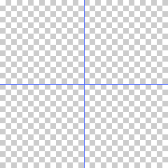
I took a new RGB document and placed two guides upon it to mark the centre of the image. Then I pressed G to activate the gradient tool, choose angle gradient set its mode to Difference and made its settings like this.
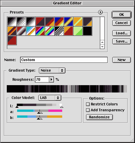
I had pressed the randomize button in the options panel a few times so that a nice distribution of black and white strips is obtained.
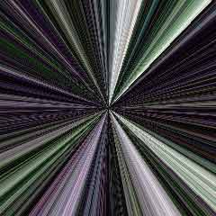
I clicked at the centre of the image as marked by those two guides and released it outside anywhere.
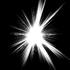
After dragging like this a few times - here is the burst of the light.
I de saturated the image pressing command+shift+u / ctr+shift+u, so that no color from the LAB color space remains on the final image.
We will add color to this light burst later in our original image which is in CMYK.
I selected some areas at the centre of the light burst using a circular marquee, applied a little feather and pressed filter - blur - Gaussian blur. I adjusted the blur amount so that the ziggy lines at the centre of the light burst almost disappear.
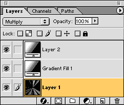
Then I added a black and white radial gradient layer atop of this layer and set its blend mode to color dodge.
I cropped this gradient layer, set its gradient scale to more than 100% and set its blend mode to color burn.
This have made an output like this. This is the base for the flare effect
Note that this new image has been prepared in RGB, now it’s time to take it to our original image where it will be converted to CMYK. Some adjustment is needed to make the black real black over there.
Some distortion or scaling and proper placement is also done so that the flare looks like it’s coming out of mahadeva's head.
Finally I renamed this layer as flare and set its blend mode to screen.
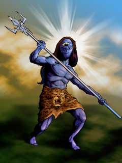
This is what comes out of all this process.
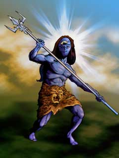
As I had done with the land and sky, I adjusted the gradient map of this flare layer to add some intermediate tint. a medium blue is cool. And after this adjustment the flare looks like this.
You can see the difference between these two pictures, in the second image the flare is more 'sparky' and 'organic' than the flat first one.
This is the end of the sixth part, you can revise the previous part Creating a background
or continue reading the last part of this tutorial
Creating the blurb
Part 1 : Creating a workspaceThis far everything is going well and the result we obtained is as per our expectation.
Part 2: Coloring the character
Part 3 : Coloring accessories
Part 4 : Adding shadows and highlights
Part 5 : Painting the drappery
Part 6: Creating a background
Part 7 : Adding effects
Part 8 : Creating the blurb
But the characteristics of Mahadev is not registered yet, because I have drawn him as some kind of 'extra-terrestrial being. but still now he is looking not more than a human or to be more precisely, he is looking like a freak like Cyclopes.
How to put godly effect on him? Of course the answer is to put a halo or flare behind his head as we see on the calendars. Let’s begin...
I took a new RGB document and placed two guides upon it to mark the centre of the image. Then I pressed G to activate the gradient tool, choose angle gradient set its mode to Difference and made its settings like this.
I had pressed the randomize button in the options panel a few times so that a nice distribution of black and white strips is obtained.
I clicked at the centre of the image as marked by those two guides and released it outside anywhere.
After dragging like this a few times - here is the burst of the light.
I de saturated the image pressing command+shift+u / ctr+shift+u, so that no color from the LAB color space remains on the final image.
We will add color to this light burst later in our original image which is in CMYK.
I selected some areas at the centre of the light burst using a circular marquee, applied a little feather and pressed filter - blur - Gaussian blur. I adjusted the blur amount so that the ziggy lines at the centre of the light burst almost disappear.
Then I added a black and white radial gradient layer atop of this layer and set its blend mode to color dodge.
I cropped this gradient layer, set its gradient scale to more than 100% and set its blend mode to color burn.
This have made an output like this. This is the base for the flare effect
Note that this new image has been prepared in RGB, now it’s time to take it to our original image where it will be converted to CMYK. Some adjustment is needed to make the black real black over there.
Some distortion or scaling and proper placement is also done so that the flare looks like it’s coming out of mahadeva's head.
Finally I renamed this layer as flare and set its blend mode to screen.
This is what comes out of all this process.
As I had done with the land and sky, I adjusted the gradient map of this flare layer to add some intermediate tint. a medium blue is cool. And after this adjustment the flare looks like this.
You can see the difference between these two pictures, in the second image the flare is more 'sparky' and 'organic' than the flat first one.
This is the end of the sixth part, you can revise the previous part Creating a background
or continue reading the last part of this tutorial
Creating the blurb
Comments
Post a Comment